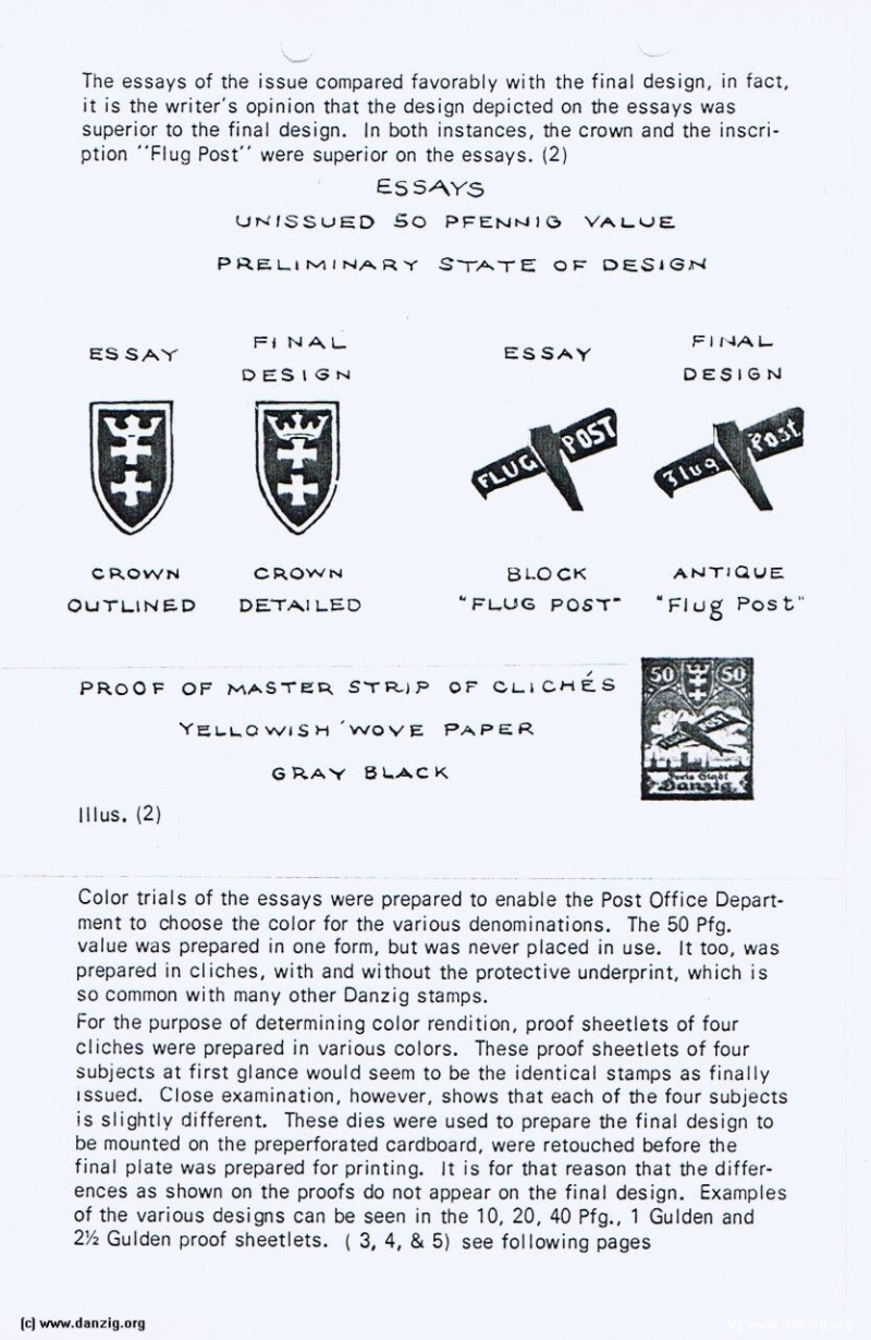
The essays of the issue compared favorably with the final design, in fact, it is the writer’s opinion that the design depicted on the essays was superior to the final design. In both instances, the crown and the inscription “Flug Post” were superior on the essays. (2)
ESSAYS
UNISSUED SO PFENNING VALUE
PRELIMINARY STATE OF DESIGN
PROOF OF MASTER STRIP OF CLICHES
YELLOWISH’WOVE PAPER
GRAY BLACK - - IlIusstration 2
Color trials of the essays were prepared to enable the Post Office Department to choose the color for the various denominations. The 50 Pfg. value was prepared in one form, but was never placed in use. It too, was prepared in cliches, with and without the protective underprint, which is so common with many other Danzig stamps. For the purpose of determining color rendition, proof sheetlets of four cliches were prepared in various colors. These proof sheetlets of four subjects at first glance would seem to be the identical stamps as finally issued. Close examination, however, shows that each of the four subjects is slightly different. These dies were used to prepare the final design to be mounted on the preperforated cardboard, were retouched before the final plate was prepared for printing. It is for that reason that the differences as shown on the proofs do not appear on the final design. Examples of the various designs can be seen in the 10, 20, 40 Pfg., 1 Gulden and 2 1/2 Gulden proof sheetlets. ( 3, 4, & 5) see following pages
Danzig Report Nr. 5 - October - 1975, Page 3.
Hits: 3337
Added: 24/05/2015
Copyright: 2025 Danzig.org

